Local SEO Dashboard: Boost Your Business Performance
Most Monday mornings in the UK start the same way for local teams. Someone opens Google Business Profile, another person checks Search Console, a review has landed overnight, and a rank tracker says one branch is holding steady while another has slipped in a postcode that used to convert well. By the time the screenshots are copied into a spreadsheet, the urgency has already moved on, and the branch manager is asking why calls are down while the dashboard still looks busy.
That gap is why a local SEO dashboard matters. It brings together the signals that shape local demand, then shows them by location instead of burying them inside one blended report. For multi-location businesses, agencies, and independent operators, that difference decides whether you spot a problem early or explain it after the opportunity has gone.
Why Local Visibility Now Lives Inside a Dashboard
A local business rarely loses visibility all at once. It slips, branch by branch, postcode by postcode, until the numbers in different tools stop telling the same story. One location may still be getting Search views and Maps views in Google Business Profile, while another is generating fewer calls, fewer direction requests, and fewer website visits, even though the overall account still looks healthy in a monthly report. Google's local visibility signals, combined with branch-level reporting, are the only practical way to see that difference clearly, as noted in local SEO reporting guidance.
Monday morning brings real frustration. An owner checks one spreadsheet, an agency account manager checks another, and the person replying to reviews is working from inbox alerts that never make it into the wider picture. By the time someone notices that one branch in Manchester is outperforming another in Birmingham, the delay has already cost response time, momentum, and in some cases customer trust.
The problem with blended reports
Blended reporting flattens the very thing local SEO is supposed to protect, location performance. It hides whether demand is rising in one catchment and falling in another, which is a poor fit for UK businesses competing in dense urban areas and regionally distributed service territories. A dashboard built for local work needs to separate branches, compare them against their own history, and show which one is converting attention into action.
Practical rule: if a report can't tell you which branch is winning in which area, it's not a local report yet.
The shift to dashboard-led reporting came from teams needing one place to see Google Business Profile, search analytics, rankings, and reviews together. That approach is now treated as standard practitioner practice, with guidance recommending automated dashboards and a tighter focus on a small set of metrics that link to goals rather than vanity data, as described in modern SEO reporting dashboard guidance. For UK operators, that is less about aesthetics and more about speed, because local decisions are often made on this week's visibility, not last quarter's traffic.
What a Local SEO Dashboard Actually Is
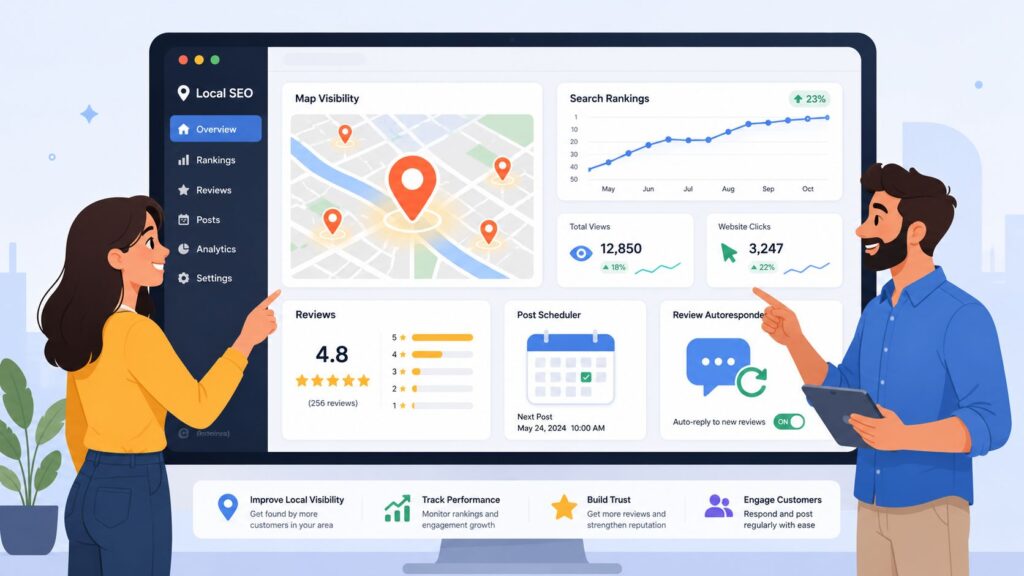
A local SEO dashboard is a central reporting hub that pulls together Google Business Profile, Google Search Console, Google Analytics 4, review activity, and rank tracking, then breaks the results out by location so you can compare branches on equal terms. A dashboard functions like a control panel for a chain of shopfronts. Each gauge represents one location or service area, and each dial shows whether visibility is turning into real customer behaviour.
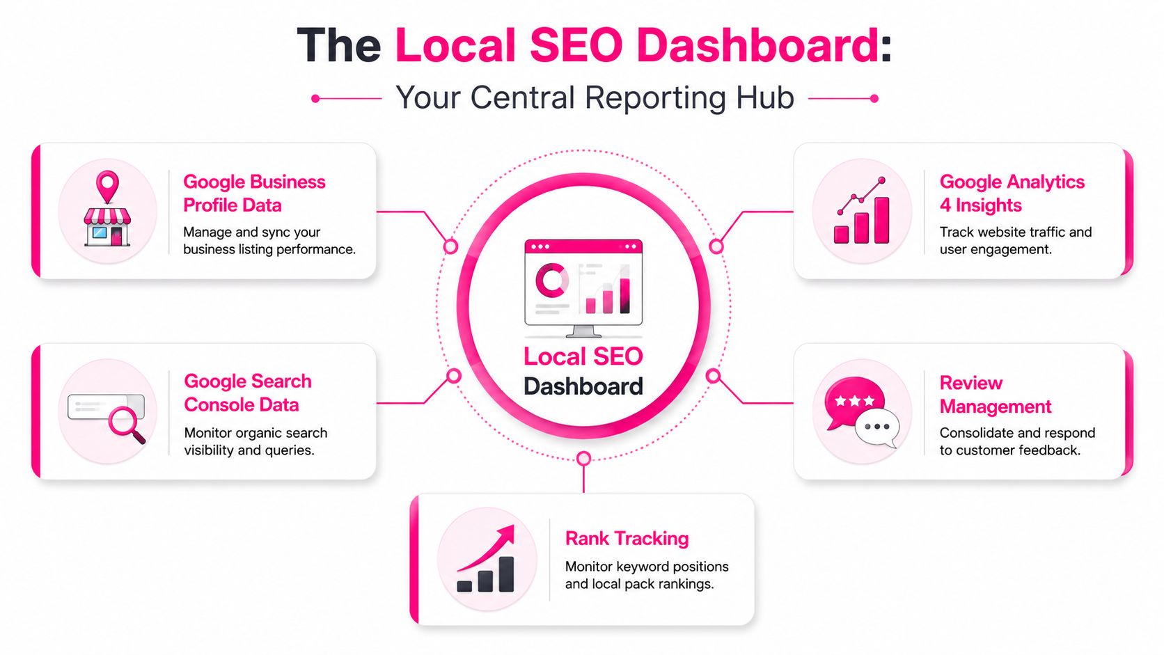
That makes it more than a tidier spreadsheet. It is also not a substitute for active optimisation, because categories, hours, photos, reviews, links, and landing pages still need hands-on work. Its value is in giving SEO, operations, and frontline teams the same view of what is already happening, so they stop arguing over isolated numbers and start working from the same evidence.
What it should pull together
A useful build usually includes:
- Google Business Profile data, because GBP is where local visibility and customer actions show up first.
- Google Search Console and GA4, because you still need to see how local queries and landing-page traffic behave once users leave Maps.
- Reviews and response activity, because reputation work and visibility work are tightly linked in real local search workflows.
- Rank tracking, ideally with local pack and geo-grid views, so you can see how performance changes across nearby areas rather than only at one spot.
If you want a simple product example of this centralised approach, a local seo platform such as LocalHQ combines location data, reviews, and reporting inside one interface. For UK teams, that matters because a few streets, a town boundary, or even one postcode can change who sees you and who books elsewhere.
The shorthand I use with clients is straightforward. A generic analytics dashboard shows what happened on the site. A local SEO dashboard shows what happened in the map pack, in the listing, and at the branch. Those are different questions, and they need different screens.
A good dashboard also has to support decisions across different operating models. A single-location SMB needs a clean view of calls, direction requests, and reviews without noise. A multi-location brand needs branch-by-branch comparison, clear ownership, and a way to spot uneven performance across regions. Agencies need a format that lets them show progress without hiding the trade-offs between data sources, which is why teams that want to master data visualization often design around location-first reporting rather than generic web metrics.
Core Features and Metrics a UK Dashboard Must Cover
A UK-ready dashboard has to do less than most vendors promise, but more of the right things. The job is not to bury users in charts, it is to show whether local visibility is creating action. That means prioritising the metrics that connect directly to calls, direction requests, website visits, and review activity, while still keeping an eye on local rankings and NAP consistency.
A branch can look healthy in one report and weak in another if the dashboard is built around the wrong source. For UK teams, that usually means the control panel must separate what happens on the listing from what happens on the site, then tie both back to postcode-level demand.
Start with the signals that create demand
The first layer should be Google Business Profile performance, because GBP is where local visibility shows up through Search views, Maps views, and customer actions such as calls, website visits, and direction requests, as set out in local SEO reporting guidance. Those are the numbers most UK operators can act on quickly. If a branch is visible but nobody is calling, the problem is different from a branch that is not being shown at all.
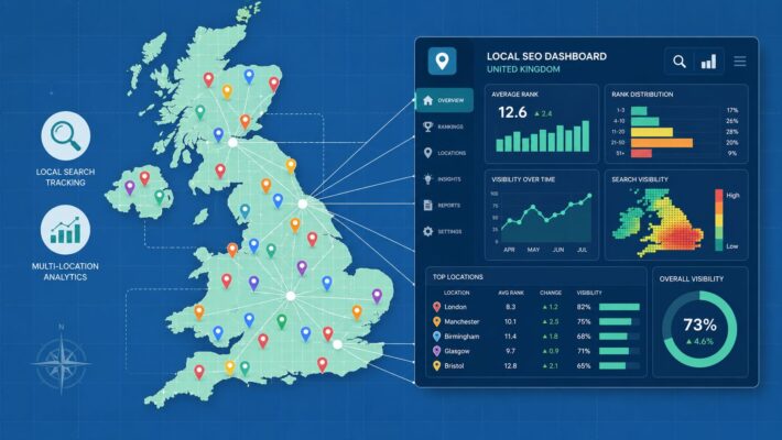
The next layer should cover postcode or town-level segmentation, because UK search demand is local in a way generic city dashboards often miss. If one branch is gaining traction in a dense catchment while another is weak in a nearby postcode, you need to see that separation cleanly. ONS urban population reporting is the right place to check the underlying population pattern, while a dashboard example can help show how that context is presented in practice, and the country's urban concentration is exactly why small shifts in map visibility can matter so much in nearby neighbourhoods ONS urban population data.
Features that earn their keep
A good dashboard usually includes:
- UTM-tagged GBP links, so you know which clicks came from the listing itself.
- Separate views for calls, direction requests, and website clicks, so engagement does not get bundled into one meaningless click count.
- Geo-grid rank tracking, so you can compare visibility across the territory a branch serves.
- Review velocity and response tracking, because reputation work needs a rhythm, not occasional cleanup.
- NAP consistency checks, because location data drift creates confusion that is often noticed only after rankings wobble.
For teams that want a tighter reporting framework, master data visualization is worth studying because the same principle applies here, clarity beats decoration. If a chart does not help someone decide what to do next, it is taking up dashboard space that should belong to a metric that does.
Practical rule: separate visibility from conversion. One tells you whether people can find you, the other tells you whether they bothered to act.
LocalHQ's analytics at LocalHQ's comprehensive analytics fits that model by focusing reporting on location-level actions rather than generic site traffic alone. That is the right direction for UK teams that need to see whether a visibility gain is producing phone calls, directions, or visits.
Who Uses a Local SEO Dashboard and How Their View Differs
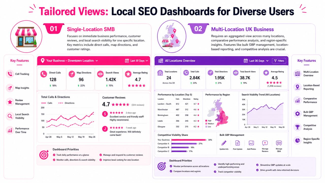
A dashboard should not look the same for every business. A single-location practice, a regional chain, and an agency all need different information density, different permissions, and different outputs. If you force them into one layout, somebody ends up ignoring half of it.
Single-location SMBs need immediate prompts
An independent restaurant, dental practice, solicitor, or home services firm usually wants a simple answer. Are people finding us, are they calling, and are they leaving reviews? The dashboard should spotlight the current branch, show review activity at a glance, and make it obvious when a GBP update, reply, or post is overdue.
That user does not need a forest of competitor layers or a complex multi-client switcher. They need one view, one location, and one set of actions they can complete before lunch. If the dashboard can prompt them to respond to a review and check whether their latest post drove engagement, that is already useful.
Multi-location operators need comparison and control
A UK brand with several branches needs the same data, but with an entirely different layout. The first need is comparison, not detail, because the point is to spot which branch is lagging and whether the gap is a visibility problem, a reputation problem, or a conversion problem. Colour-coded location views, branch drill-downs, and territory segmentation matter more here than a long list of generic SEO indicators.
If your business fits that model, it helps to streamline your GBP management before you worry about polishing reports. The operational work and the dashboard need to match, or the numbers will keep exposing the same mess every week.
Agencies need speed, permissions, and clean output
An agency running dozens of accounts needs a different layer again. White-label reporting, quick client switching, and permission control become core features because the dashboard is part of a wider delivery system. The report has to prove value without requiring the account manager to rebuild it every month.
For agencies handling several estates, boost local visibility for franchises is the right filter to apply when evaluating tools. If the platform cannot handle location-level comparisons cleanly, it will create more reporting work than it removes.
Choosing and Rolling Out the Right Dashboard
The wrong dashboard usually fails in two ways. It is either too light to be useful, or too heavy for the team to maintain. The best choice sits in the middle, with enough data connections to answer real questions and enough simplicity that people open it each week.
A practical selection checklist
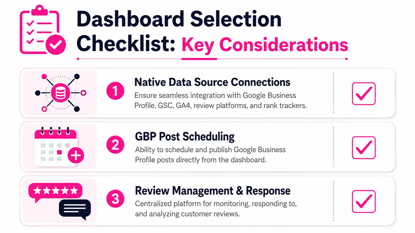
Start by checking whether the platform connects natively to the tools you already use. Google Business Profile, Google Search Console, GA4, review platforms, and rank trackers should not require a maze of exports. If a system only becomes useful after a series of manual uploads, it will age badly the moment your estate changes.
Then test the operational features that save time day to day. Can it schedule GBP posts? Can it surface review activity in one place? Can it handle geo-grid rank tracking with enough granularity to matter for your towns, catchments, or postcodes? If it cannot, the reporting may look polished while the workflow stays messy.
Practical rule: buy for the next six months of use, not for the demo.
If you are weighing dashboard views against query and Search Console work, Month17 GSC data solutions is a useful reference point because it highlights the value of clean source connections. The same logic applies here, a dashboard only earns its place if the data arrives in a form the team can trust.
Roll it out in a sane order
Do not launch across every branch at once. Start with one pilot location, agree the baseline metrics, and set a review-response cadence before you expand. That gives the team a chance to see whether the dashboard matches reality or just rearranges it more neatly.
For franchises and larger estates, it is worth aligning the rollout with the wider operating rhythm. That includes who owns replies, who updates listings, who checks the map-pack view, and who reviews the weekly output. LocalHQ franchise SEO guide is a sensible internal benchmark if you need to avoid making the same location-management mistakes across multiple branches.
The fastest way to make a dashboard stick is to tie it to an actual meeting. A short weekly review, with the same people and the same core metrics, turns the dashboard into a working tool instead of a passive report. Once that happens, the value becomes obvious.
Common Mistakes That Undermine Dashboard Value
The biggest mistake is assuming more widgets mean better insight. In local SEO, they usually mean the opposite. A dashboard that tries to show everything ends up hiding the only things that matter, which is why so many teams keep asking for “one more view” even when the underlying problem is already visible.
Too many metrics, not enough decision-making
A practical framework recommends limiting dashboards to 5–7 core metrics and comparing current performance against previous periods, which is especially useful when a team needs fast trend reading, as noted in SEO KPI dashboard guidance. That advice is sensible because local teams do not need twenty numbers to decide whether a branch is healthy. They need a short list they can scan in seconds.
The next mistake is mixing visibility and conversion in one muddled view. A branch can look strong in maps and still fail to generate calls if the listing is weak, the hours are wrong, or the review profile looks neglected. If the dashboard does not separate those outcomes, it can make a weak location look healthier than it is.
What gets missed most often
- Postcode-level differences get flattened into city-wide averages, which is fatal in dense UK markets.
- Review quantity gets treated as a proxy for review quality, even though the customer response pattern matters more.
- Reports get sent to managers who never read them, which is the surest sign that the dashboard serves the tool, not the team.
- Analytics health is assumed rather than checked, even when the numbers stop matching real customer activity. If that sounds familiar, the checklist in signs your analytics is broken is a helpful diagnostic.
The cleanest dashboards feel almost restrained. They show what changed, where it changed, and whether anyone acted on it. That is why the best local dashboards are often the ones a non-specialist can glance at once a week and still make the right call.
Putting It All Together and Getting Results
A useful rollout does not need a long project plan. Pick one pilot location, connect GBP and Search Console, and agree the small set of metrics that matter for that branch. Then set your review-response cadence, decide who updates posts, and book a weekly 20-minute meeting to look at the same numbers every time.
That rhythm matters more than fancy design. Once the team knows the dashboard is tied to calls, direction requests, reviews, and postcode-level visibility, it stops being a reporting artefact and starts shaping decisions. For UK businesses, that is the point. Local visibility is territorial, so the dashboard needs to be territorial too.
If you want a local SEO dashboard that keeps branch-level visibility, reviews, and map performance in one place, take a look at LocalHQ. It's built for the kind of reporting UK chains, independents, and agencies use, with location-aware insights that make it easier to spot what's working and what needs attention.